How to Choose a Color Palette for Your Personal Brand (When You’re Not a Designer) | Episode 5
Get a One Week Free Trial at Carr Workplaces
When I was first getting started building my personal brand, one of my favorite parts was creating my visual identity. It made everything feel real, especially in the beginning phase when I was just starting to bring my vision to fruition. In the Personal Brand Accelerator, my 12-week program that teaches entrepreneurs how to build their personal brand, my students learn how to create their own visual identity. What is a visual identity? We define it as a cohesive collection of graphical elements that are chosen intentionally to bring your personal brand to life. The purpose of a visual identity is to create an emotional impression on your audience and inform your Ideal Brand Adopter about the essence of who you are and the many different aspects of your personality and professional expertise.
During the process of creating your visual identity, you will select a color palette, typography, and mood words to describe the way you want people to feel when they see your brand. In today’s post, I’ll teach you how to select your own color palette without knowing color theory or being a professional designer. Let’s dive in!
Start with Pinterest
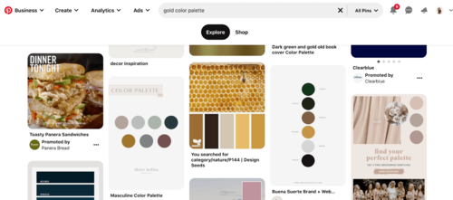
Pinterest is a visual discovery engine that allows you to save and organize images and resources in customized Pinterest boards. Pinterest is a great way for you to gain clarity around your aesthetic preferences. I recommend creating a new (private) board specifically for your personal brand. After you’ve created your board, think of one color that you really love. For example, I love the color gold. So, if I wanted to use Pinterest to help me create a color palette using the color gold, I would type into the search bar, “Gold Color Palette.” Pinterest will automatically generate different color combinations with gold in it. I’ll search through the many options until I find ones that I like. I’ll save the ones I like most.
It’s important not to save pins aimlessly. There should be a reason for every pin. To ensure that you are pinning with a purpose, annotate each pin with 1-2 comments about why you like it. This practice will help you define your aesthetic preferences and inform you on which colors you like best.
After you’ve pinned color palettes to your personal brand board, I recommend pinning lifestyle images that represent the kind of aesthetic you’d like to convey on your website and social media profiles. It’s okay if this feels “aspirational,” let yourself dream big! What kind of aesthetic is your ideal aesthetic? Here’s an example of my brand board.
Pinning different “lifestyle” images will help me see what colors are the most appealing to me. By looking at the screenshot above, it’s easy to see that I like warm, neutral tones with lots of white and pops of gold. Noticing these images helps me narrow down my color choices and select the swatches that are an honest representation of who I am and what I like.
Audit your closet
Another good way to determine the right color palette for you is by giving your closet an audit. What color do you have in your clothes the most? What colors are you drawn to in stores or boutiques? Ask yourself whether you prefer: a clean, polished and professional look or a style that is more eccentric, vibrant, and bold? Take stock of the clothes you wear most often and use specific language to describe these clothes and what you like about them. Notice everything and write what you see in your journal. The goal is to give people the same impression of you online as you would give them offline. Can you envision the style of your clothes translated into the style of your website?
Create Your Own Brand Board in Canva
Canva is a free online program that allows you to create designs and documents using their drag-and-drop features. As you continue building your personal brand, you may find yourself using Canva more and more. Canva offers a free plan as well as a paid pro plan (totally worth it!) To do this right, I recommend starting with a page that has five blank circles (shown below).
Next, use the Eyedropper Tool which allows you to identify colors from web pages and photographs in order to develop your own personal color palette. Start building your color palette by taking swatches of color from your Pinterest board and pasting them in your Canva Brand Board. It might take some time to get it just right. Once you’re finished, it should look something like this:
Update the colors on your website
The best way to see if your color palette “works” is by testing it out on your website. Don’t have a website yet? Join the waitlist for Personal Brand Accelerator. I’ll teach you how to structure your personal website and write good copy that converts your audience into clients and customers. (You can’t find this framework and formula anywhere else!)
As you're testing your color palette on your website, try “color blocking” on content-heavy web pages to break up the elements and give them room to breathe. Don’t be afraid to start over. When I was first establishing my color palette, I found that I was using colors I liked but weren’t necessarily “me.” I first needed to see how it looked on my website before I could realize that I needed to change things and start over with a different palette.
A good rule of thumb is to let your website sit for a few days and then come back to it to see how it looks. Sometimes it takes a few tries before you’re ready to settle on something for good. Remember to have fun with the creative process without letting it burden you, don’t take it too seriously, take breaks and give yourself lots of grace. You’ve got this!


